The Office
Business Type: Coworking Space
Location: Luxembourg City, Luxembourg
Task: Create a Visual Identity
I worked for The Office for a summer as an intern. During that time, I got a very good understanding of how the business operates. At the time, they had a very basic logo and not much else in terms of visuals.
The company was at the beautiful point when a startup is turning into an established business. In a meeting with the CEO, I told her why this was the right time for The Office to adopt a unified and recognisable visual identity. Over the next month, we worked on several aspects of the visual identity.
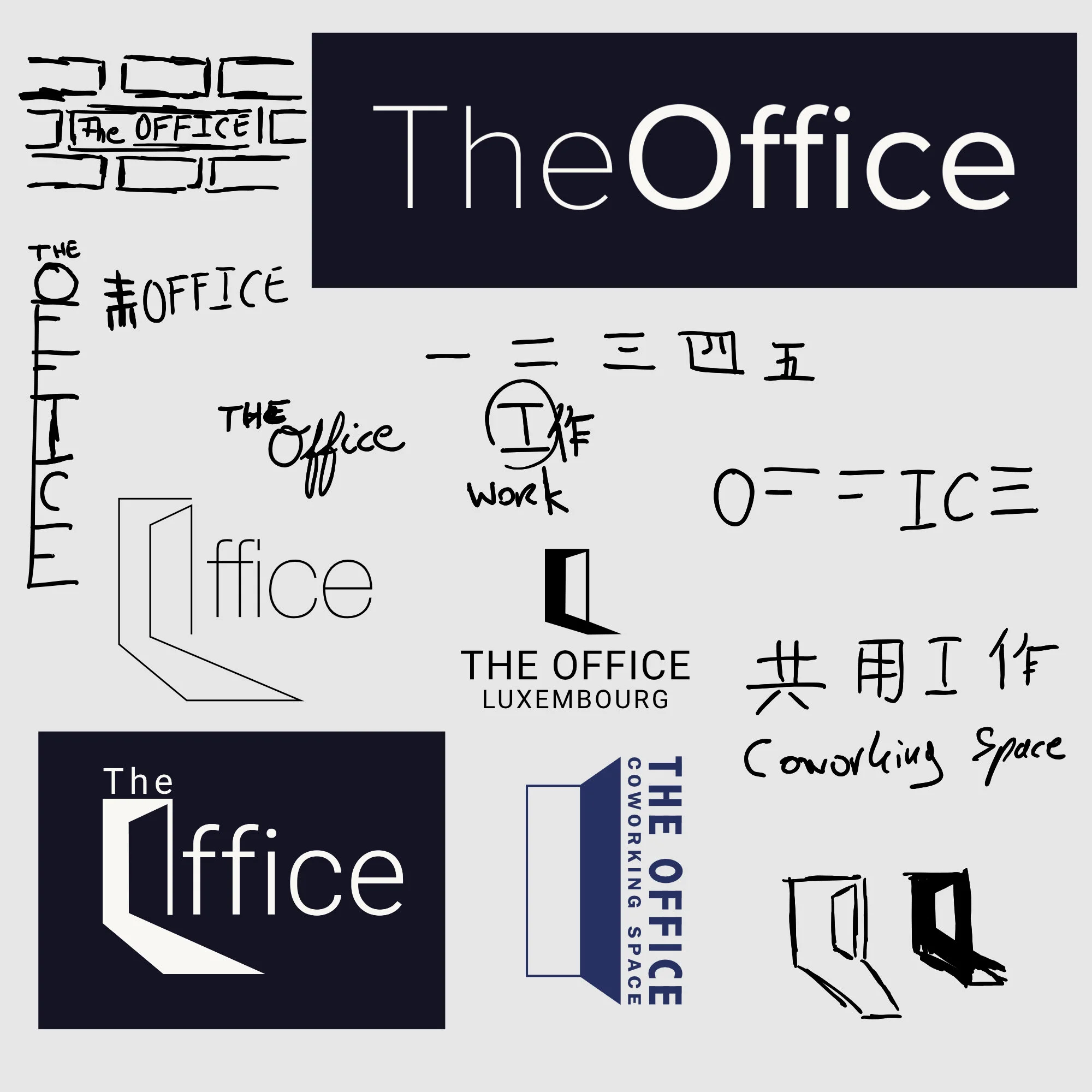
The design process resulted in more than 50 design concepts for the logo.
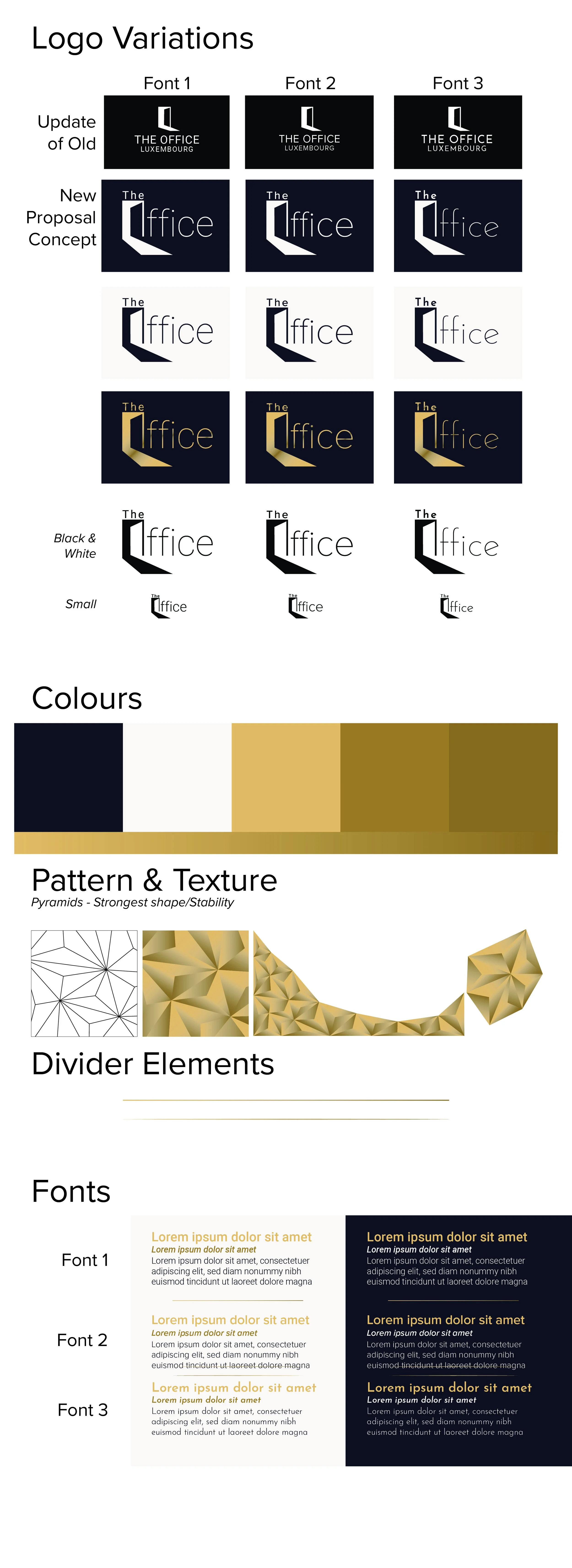
Using gold in the logo and the visual identity was one of the stipulations of the CEO. The new logo kept the spirit of the previous one, but the shape was adjusted and integrated into a stylised font to make it look more professional and sophisticated.
Overall, we worked together on 10-15 various projects which used or developed the visual identity. These ranged from advertising posts for social media to standardising document templates, and included work on internal projects.
It fills me with pride to see the logo I have created for The Office in many different places as the company is active in the business community and representing various worthwhile causes.
Many of the projects with this client cannot be shared due to a non-disclosure agreement.
Example of work in progress: Logo Sketches & Concepts
Example of work in progress: Concept Brandboard


